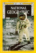
 The Timeless Beauty of National Geographic is a wonderful article examining the stability of a famous brand aesthetic. (I used to love reading NG in my elementary school library when I was a kid and just last year decided to get my very own subscription. Every article in every issue is fabulous, just as they always have been.)
- “The most well-known use of Spencerian script is, arguably, the Coca-Cola logo. The logo was designed in the 1880s by the company’s bookkeeper, Frank Robinson.”
- Repeat after me: Taking Photos In Public Places Is Not A Crime
- National Public Radio is changing its name to NPR. (I guess that’s better than Dweezil.)
- Finally! More photos of kitties in wigs!
- “Losing friends is inevitable. Making enemies is not.” — from 35 Lessons in 35 Years
- “This year is the 30th anniversary of The Empire Strikes Back, the Star Wars sequel that many fans consider the pinnacle moment in a franchise that has pulled in $16 billion in box office and merchandising. But 1980 was also the year that Kurtz and Lucas realized the Jedi universe wasn’t big enough for the both of them.”
- Technology is great, for sure, but you’ll never pick up your iPad and find a perfectly preserved, century-old press pass to a World Series game in its digital pages.
- “Resizing my browser window to make sure it fills up my entire screen will not make me focus on your pretty pictures or admire your wicked design.”
- If you’re looking for seriously advanced computer knowledge — like how to determine the size of an image of Robocop riding a unicorn — take a look at Unicorn Tips.
2024-05-30: Broken links in this post have been removed and/or updated.